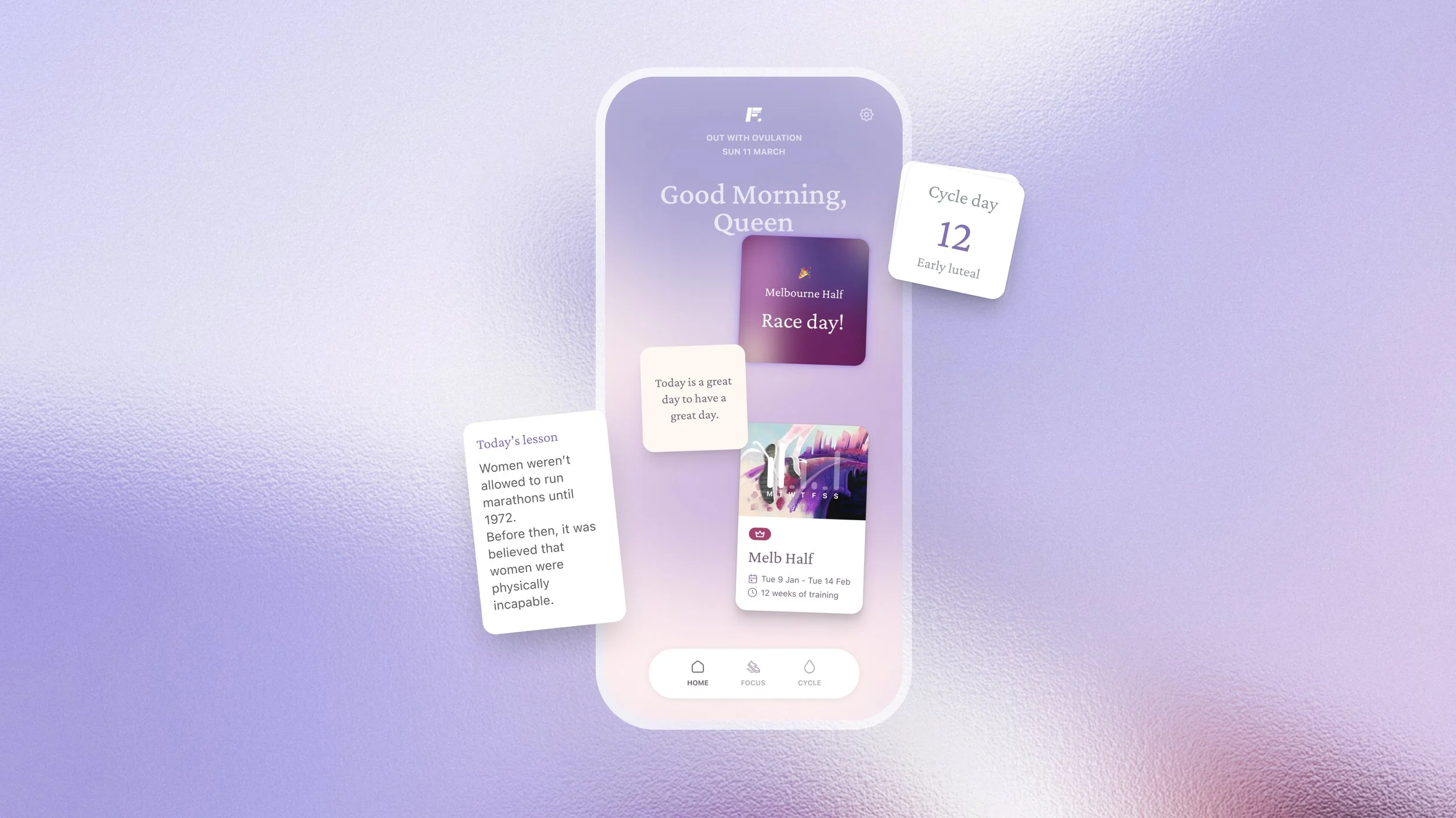
Redesigned Homescreen
From Chaos to Clarity
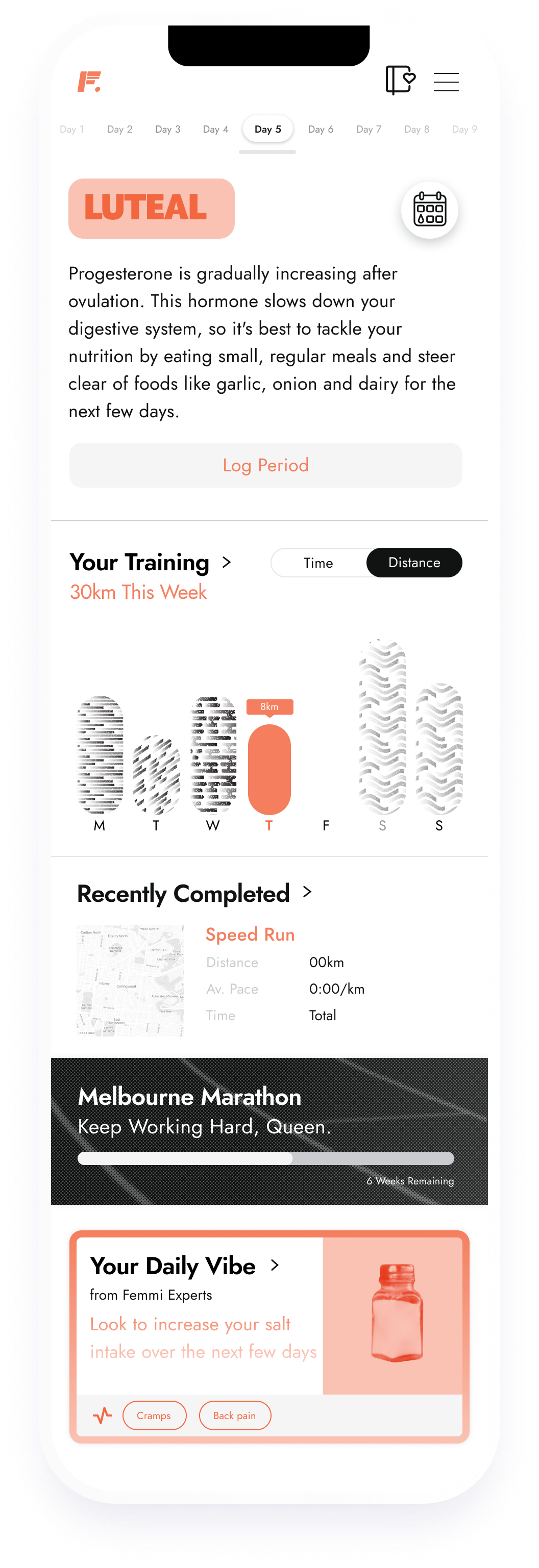
The original homescreen design was a cluttered mess that left users feeling overwhelmed and frustrated. The feedback was loud and clear: it was time to simplify.
Challenge
Users were bombarded with long blocks of text and an unintuitive UI that didn’t guide them to the information they needed.
We faced the daunting task of stripping down the clutter without sacrificing essential features.
Process
Through a combination of qualitative interviews and quantitative surveys, I identified the key expectations our users had for their homescreen experience. This research revealed the desire for a streamlined interface that focused on daily tasks rather than a laundry list of everything happening in the app.
To tackle this, I introduced Design Principles that emphasised clarity and consistency—values that resonated not just with our users but also with our team culture.
-
We don’t just follow the pack. Every decision is carefully weighed, and we’re not afraid to zig where others zag. We strive for innovation that pushes boundaries and creates fresh, bold experiences.
-
Strength, resilience, and authenticity aren’t just buzzwords—they’re at the core of who we are. We go all in, take risks, and embrace the power of standing out from the crowd.
-
We’re her biggest fan, the hype squad that’s always there to remind her she’s capable of more. Whether it’s a new personal best or just lacing up for a run, we’re cheering her on.
-
Her path is unique, and we’re here to help her own it. We give her the tools, support, and affirmation she needs to see that she’s more than enough, every step of the way.
Solution
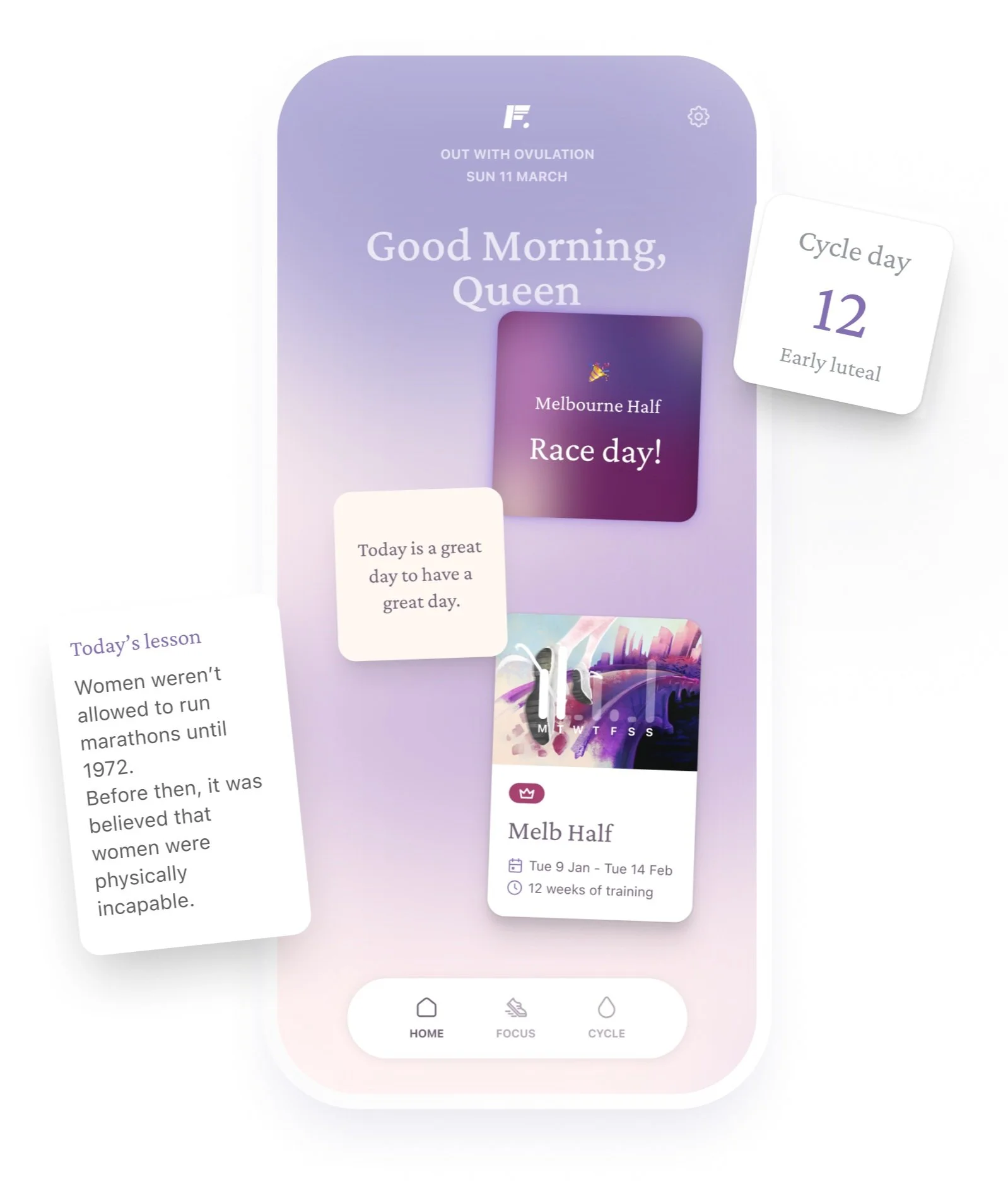
We transitioned from a chaotic layout to singular cards that showcased crucial information in a digestible format.
Our new "today" screen provided users with a quick snapshot of what was happening in their running journey, ensuring they could engage without feeling overwhelmed.
Results
Increased Daily Active Users
Following the launch of the new homescreen, we saw a 30% increase in daily active users within the first month.
Improved User Satisfaction
Post-launch surveys indicated a 25% increase in user satisfaction ratings related to navigation and information access.
Conclusion
By prioritising user needs and stripping away the unnecessary, we transformed a frustrating experience into an empowering one.